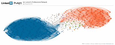
What's going on here? In a nutshell, my map reflects two major networks I am a part of: My MIT Sloan Fellows class (blue) and IDG Enterprise (orange).
The Sloan Fellows group of about 100 people are so connected with each other (i.e., nearly everyone is connected with everyone else in the group) that the lines between them form a nearly solid mass of blue. A few people on the outside of the blue mass are MIT students from other programs (e.g., the two-year Sloan MBA) who have a few connections with others in my class.
The orange network consists of former colleagues at IDG Enterprise -- mostly editors and technical staff but also some business executives. There are also many lines between them, but not nearly to the same degree as the Sloan Fellow network. That's because the IDGers are more likely to be connected to people in their own publications (Network World, Computerworld, The Industry Standard, etc.) and/or to people having similar roles (editors with editors, developers with developers, etc.). As I worked at three IDG publications and in many cross-functional teams from 1999 to 2010, I am pretty well connected across these groups.
Smaller LinkedIn groups: Who are they?
There are some interesting small groups near the center of my galaxy. They aren't necessarily close to me; rather, it appears smaller networks (light orange, green, and magenta) or single connections (gray lines) are shown nearer to the center of the visualization. The colored networks include a group of a half-dozen people (green) I met at the State of Play conference in 2007 and connected with on LinkedIn immediately afterwards. I haven't had much contact with any of them since then.Another group (magenta) consists of high school pals who I have had regular contact with over the years, but are barely noticeable on the map, owing to the fact there are only four of them. Actually, there should be five magenta dots, but one of the guys who is connected with me is not connected with any of the others, and therefore shows up as a single grey dot -- even though he happens to be one of my closest friends.
LinkedIn Taiwan
Not reflected at all is my extensive network in Taiwan, which I developed over a six-year period in the 1990s when I lived in Taipei. If it were visualized, it would have about 20-30 people with slightly less density than my IDG network.Why isn't it there? Two reasons that come to mind are the network predates LinkedIn by many years, and many of the people who I know from that period of life are Taiwanese and are therefore less likely to be LinkedIn users (social network usage in Taiwan evolved much differently than it did in the U.S. and other countries). While I have still connected with about a half-dozen people from my time in Taiwan, they show up as gray dots because I knew them from different settings (social, music, different jobs, etc.) and they are not connected with each other. It's also possible they haven't learned how to leverage LinkedIn, although there are many LinkedIn books available for people who want to understand how to create a profile and build their networks.
Nevertheless, it's an interesting visualization and makes me wonder if I need to develop other professional networks in new ways. You can try it out by visiting InMaps (Update: It's no longer active), which will require you to authenticate through your LinkedIn account.

No comments:
Post a Comment
All comments will be reviewed before being published. Spam, off-topic or hateful comments will be removed.