Showing posts with label Data. Show all posts

Monday, October 02, 2017

How to place a freeze on your credit reports

Sharing a PSA that may help some American readers. In the wake of the massive Equifax security breach exposing the personal information and social security numbers of most American adults, consider ordering the three main credit agencies to place a credit freeze on your information (required by state law upon request).

The contact numbers are listed below, and it takes less than 10 minutes per person, per agency. Freezes will prevent most types of credit-based identity theft, although you will need to lift the freeze when applying for loans, mortgages, or credit cards.

Note that if you do have your identity stolen, it is a mess to clean up, taking lots of time, bureaucracy, inconvenience, and costs, including potential legal problems or extra airport scrutiny. Most victims say it takes YEARS to clear up.

The process of freezing your credit takes about 20-30 minutes for one person if you use the automated online or phone systems offered by the three main credit reporting agencies (see below). DO NOT BE FOOLED by other services they offer, such as "credit monitoring" - Trans Union is particularly bad, exploiting the Equifax breach to sign people up for "True Identity" which is a paid premium service that offers limited protections.

Have your credit card number and social security number ready to use the following systems (you can also do it by mail, but it's slower and requires additional paperwork including a scan of utility bills and drivers' licenses). All services will send you a PIN to use later if you want to lift the freeze.

Please share this with friends, family, or colleagues.

Monday, March 26, 2012

Blogging for 10 years

Ten years ago today, I started my first blog. I was taking IT classes at Boston College at the time, and one of my instructors (Aaron Walsh, now a friend and advisor) told me about this new, powerful concept in online publishing called "blogging". Although he suggested using one of the nascent online blogging platforms at the time, I was getting my online career off the ground and decided to create my own blog, using hand-coded HTML and CSS. The result was this:


This early blog didn't last -- hand-coding pages and FTPing files to my personal site was too much of a pain -- but I liked the format of short observations with links and later photos. I started a Blogger blog in 2004, which I still maintain today (you are looking at it right now). I also expanded to many more locations on the Web. Since 2002, I have written thousands of posts that have appeared on ilamont.com, digitalmediamachine.com, Computerworld, The Industry Standard (no longer online), Harvard Extended, Ipso Facto, Terra Nova, and MIT.

What will the next 10 years bring? Surely a lot more, as content creation moves into the mobile sphere and new ways of gathering and presenting content appear on the scene. It's been a ton of fun, and I can't wait to see what happens next ...

Sunday, August 28, 2011

Visualizing professional LinkedIn networks

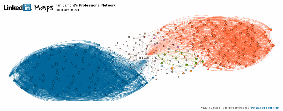
This is cool. LinkedIn has developed a visualization for members' professional LinkedIn networks. I spotted an example on a blog that I was browsing, and was curious to see what turned up for me. I was kind of surprised by the results:

linkedin data visualization

What's going on here? In a nutshell, my map reflects two major networks I am a part of: My MIT Sloan Fellows class (blue) and IDG Enterprise (orange).

The Sloan Fellows group of about 100 people are so connected with each other (i.e., nearly everyone is connected with everyone else in the group) that the lines between them form a nearly solid mass of blue. A few people on the outside of the blue mass are MIT students from other programs (e.g., the two-year Sloan MBA) who have a few connections with others in my class.

The orange network consists of former colleagues at IDG Enterprise -- mostly editors and technical staff but also some business executives. There are also many lines between them, but not nearly to the same degree as the Sloan Fellow network. That's because the IDGers are more likely to be connected to people in their own publications (Network World, Computerworld, The Industry Standard, etc.) and/or to people having similar roles (editors with editors, developers with developers, etc.). As I worked at three IDG publications and in many cross-functional teams from 1999 to 2010, I am pretty well connected across these groups.

Smaller LinkedIn groups: Who are they?

There are some interesting small groups near the center of my galaxy. They aren't necessarily close to me; rather, it appears smaller networks (light orange, green, and magenta) or single connections (gray lines) are shown nearer to the center of the visualization. The colored networks include a group of a half-dozen people (green) I met at the State of Play conference in 2007 and connected with on LinkedIn immediately afterwards. I haven't had much contact with any of them since then.

Another group (magenta) consists of high school pals who I have had regular contact with over the years, but are barely noticeable on the map, owing to the fact there are only four of them. Actually, there should be five magenta dots, but one of the guys who is connected with me is not connected with any of the others, and therefore shows up as a single grey dot -- even though he happens to be one of my closest friends.

LinkedIn Taiwan

Not reflected at all is my extensive network in Taiwan, which I developed over a six-year period in the 1990s when I lived in Taipei. If it were visualized, it would have about 20-30 people with slightly less density than my IDG network.

Why isn't it there? Two reasons that come to mind are the network predates LinkedIn by many years, and many of the people who I know from that period of life are Taiwanese and are therefore less likely to be LinkedIn users (social network usage in Taiwan evolved much differently than it did in the U.S. and other countries). While I have still connected with about a half-dozen people from my time in Taiwan, they show up as gray dots because I knew them from different settings (social, music, different jobs, etc.) and they are not connected with each other. It's also possible they haven't learned how to leverage LinkedIn, although there are many LinkedIn books available for people who want to understand how to create a profile and build their networks.

Nevertheless, it's an interesting visualization and makes me wonder if I need to develop other professional networks in new ways. You can try it out by visiting InMaps (Update: It's no longer active), which will require you to authenticate through your LinkedIn account.

Monday, July 04, 2011

Buttons won't solve the fundamental flaws of Wikipedia's editing policy

Wikipedia is rolling out a new tool called "WikiLove Buttons." The experiment, as explained by Howie Fung, Erik Moeller, and other top editors, is a weak response to a rather significant problem: Ordinary people ("new editors") don't like being shut out of articles, and when their edits are removed (or even savagely put down by experienced editors) they are less likely to want to contribute again. This undermines the crowdsourcing mission upon which Wikipedia was founded, and erodes quality. Unfortunately for Wikimedia, Inc. and its hundreds of millions of users, this roundabout way of showing appreciation for newbie edits by using a love button won't solve the problem of condescending uber-editors putting down perfectly good edits based on misguided policies, poor/incomplete understanding of topic issues, or inflated ego.


Ordinarily I wouldn't bother writing about this, but what prompted me to was the ReadWriteWeb review of the love button by Marshall Kirkpatrick. I generally like Kirkpatrick's writing but I really dislike when Wikipedia is unquestionably held up as a reliable source of information -- especially by people who speak with authority. While it can be considered a starting place for basic facts, it's hardly a reliable or complete source of information, as I described in my comment left at the bottom of the RWW article:

Disagree with the statement that Wikipedia is an "undeniably good source of information on almost any topic." For some topics, yes. But many others are flawed.

For instance, articles about famous living people are often sanitized by their handlers or supporters. Non-Western topics on English-language Wikipedia are shallow and/or unable to cite primary and secondary sources in other languages. Wikipedia editors do not view blogs as reliable sources, even if the authors are experts in said topic. And attempting to correct mistakes or add information to certain articles often brings up an array of badges, warnings, and restrictions that make it practically impossible for "the crowd" to edit.

As for the new feature, the love icons seem to be designed in a way that they make browsing and contributing more difficult. This may make things better for "top nerds at Wikipedia" but I doubt it will lead to a better product or experience for the rest of us.

Wednesday, June 08, 2011

Why new data visualizations fail to catch on


Eric Hill, a buddy of mine from my old Industry Standard days, sent me a link to a RWW article about a cool new iPad application from Bloom Studio that comes up with an interesting way of visualizing a digital music collection. The app is called Planetary, and here's what it looks like:


Planetary (voiceover) from Bloom Studio, Inc. on Vimeo.

I was impressed with what they've done, but I am afraid it won't go far in the marketplace. At one time I had so much hope for data visualizations changing the way we browse and understand information -- in fact, Eric and I spent a lot of time discussing how Industry Standard site content (news and prediction market data) could be presented in new and potentially useful ways. But in the past several years, after checking out dozens of new interfaces and data visualization schemes, I've come to the conclusion that most will never catch on.


It's not the fault of the designers, but rather the limitations of audiences. For many consumers, simple formats (e.g., longitudinal line graphs, like the inset image of the US$/Euro exchange rate over the past three months) and plain ol' headlines are all they need. I think part of the problem is grokking a new visualization requires new mental models. In my opinion, most people simply aren't willing to expend the effort, especially considering the huge amounts of information out there and limited time that people have to consume it. I've seen so many interesting, creative visualizations out there but most never make it in the marketplace. Planetary is cool, but is a solar system/galactic metaphor for browsing music inherently better than an alphabetically ordered list of artists/albums/songs?

See also:

Wednesday, March 16, 2011

The challenges of creating a mobile educational app based on Linked Data


Earlier this month, my iPod touch flashed a warning message that the provisioning profile on the test application our team (Sloan Fellow Mads, Course 6 undergraduate Yod, and myself) had designed for 6.898 in the fall was about to expire. Before it did, I decided to make a quick video showing the basic design and functionality of our educational app for the iPhone and other iOS devices:

Video: Knowton demonstrated:


While the app was ostensibly designed to teach young children geography facts, the purpose of building it was to show how Linked Data could be used to make an educational application on a mobile device. Mads' original concept was to have an open-ended exploratory app that would let children freely jump from one object to an associated fact. For instance, the child might be interested in a monkey, be able to see a picture and read some information about it, including the facts that it lives in a tree and likes to eat bananas. At that point, the child could either choose to learn about trees or fruit.

This idea is eminently suited to Linked Data, which is essentially a distributed, global-scale database  built around Semantic Web standards such as RDF, turtle/N3 and SPARQL, shared definitions, and links between repositories. There is an enourmous collection of Semantic Web-based data already available, ranging from Wikipedia information to creative commons-licensed photos.

I suggested narrowing the focus to geography, as presenting facts about animals and their habitats could be tied to a specific learning outcome. I also designed a rudimentary user interface and flow (see wireframe  below), which was eventually adopted for the exploration part of the app. Yod designed the basic game flow and built several code repositories, including the mobile app (using the iPhone SDK) and a Web app that let editors (us) submit information such as photos and descriptions. Mads devised a business plan.

In a perfect Semantic Web world, it wouldn't be necessary to have the Web app for editors, as SPARQL queries on consistently structured graphs could build the data store, with only a minimum of cleanup and selection (such as choosing the most suitable photos). But we quickly discovered that DBPedia, a popular source of country-level information for local fauna and landmarks, was incomplete. Freebase filled in many of the information gaps, but there were so many differences from country to country that the only practical way to tackle the task of preparing the data for the mobile app was by using the Web interface that Yod created. For geography and many animal photos, we used a source that one of the guest lecturers in class had mentioned, Ookaboo, which contained creative commons and public domain photos. Others were sourced from Flickrwrapper using a feature in Yod's Web application.

But for good "people" photos that could not be easily accessed in Flickrwrapper using basic search strings, I had to resort to finding creative commons-licensed (CC-SA) on Flickr itself and copy and paste URLs into the Web app. Even if we had been able to use Linked Data without the manual workarounds, there is no way we would have been able to run live queries from the mobile app -- not only are mobile network connections unreliable, but we discovered that many of the sites have high latency and/or frequent downtime (DBPedia especially!). As an alternative, Yod built a database that loaded onto the app and was instantly accessible by users.

On demo day on December 7, all of the 6.898 teams gathered in a CSAIL conference room at the Stata Center. Tim Berners-Lee and a group of outside judges watched our demos and listened to our business pitches. TBL's quick assessment of the projects is in the video at the bottom of this post, but we approached him afterwards to ask him about the curation problem. He suggested some AI alternatives. For instance, if Linked Data sources identified "China" as alternately being a country or a person, he said the app could choose the most suitable definition based on the number of returned sites in competing Google searches.

TBL asked about photos in Flickrwrapper. Could Flickr ratings be used to choose better-quality photos? Yod said no. TBL suggested that some geocoded logic could be used to get the best Big Ben photo. "Make sure it's 300 meters west at a certain time during the day," he said, and then joked: "But how can you be sure that it's not a photo with Aunt Jenny in the frame?" He speculated that an algorithm could help choose photos based on contrast or some other value.

Video: Tim Berners-Lee reviews the 6.898/Linked Data Ventures class projects (Knowton comments at 2:50)


Other posts about my MIT Sloan Fellows experience:

Sunday, January 23, 2011

Google's spam and content farm problem is not "better than it has ever been"

(Update below) I use Google Alerts to keep abreast of certain topics, such as my MIT program and mentions of my name. The automated search results that are emailed to me are interesting, particularly the ones based on my name. They almost always look like this:


The results are garbage, filled with contextually unrelated and bizarre terms such as "Lamont Arizona" or "lamont rupture disk." The links in the screenshot above take users to a page filled with links about Georgia real estate and references to many random terms (including my name), while the Danish site contains scores of random terms that include my last name (such as product or business names -- "Lamont auto", etc.), but no links. They contain no useful information about me or any other topic, yet pages like them are generated every week and added to Google's index. I looked back at my email archive, and found that pages created more than a year ago are still active.

What is their purpose? Pages like this are machine-generated spam, designed to get eyeballs on pages filled with advertisements, or to boost the search-engine ranking of linked sites. Google's wonderful search engine depends on language in headlines and page text as well as inbound links to determine which sites deserve to be at the top of search engine results when certain terms are typed in. That's great for quality sites which have lots of inbound links and deserve to be at the top because they are likely to be the most relevant and useful for users.

The problem is the system has been effectively reverse-engineered by spammers and content farms who are adding little, if any value with spam pages and poorly written trash or copied content that are boxed in by ads and affiliate links. In some cases, the pages don't contain any ads, but lots of links to other pages that someone wants to raise in the search engine rankings. Links and search-engine ranking translates to money if the keyword is popular or relates to something that people research online with the intention of buying. The ultimate prize for the spammers and content farms is getting their garbage on the first page of Google search results. The fact that quality pages (or the original content) that people are more likely to be interested in are pushed down or off the page are of little concern to them.

So I read with some interest a post by Google's Matt Cutts on the company's recent efforts to fight the problems described above. He said:
January brought a spate of stories about Google’s search quality. Reading through some of these recent articles, you might ask whether our search quality has gotten worse. The short answer is that according to the evaluation metrics that we’ve refined over more than a decade, Google’s search quality is better than it has ever been in terms of relevance, freshness and comprehensiveness.
Say what? I don't know what sorts of metrics Google is using, but I see poor quality results showing up in almost all of the searches that I perform. Not always on the first page -- on a Google search for my own name, there are enough high quality results (my blogging and social networking activity, plus references to other people with the same name) that push the garbage off the first page of search engine results. Still, starting at the top of page 3 of the results, I see results for bogus/scammy paid ringtone and "fast download" schemes attached to copyrighted technical mp3s that I produced for Computerworld when I was an editor there. Besides being illegal, such pages are not the original source of the mp3s (the pages on Computerworld.com are) yet the scraped content repackaged into paid services ranks higher than the originating site, which offers the mp3s for free.

For popular terms, however, the garbage routinely outranks the real thing. For instance, when you search for "online education," affiliate garbage dominates the first page of results. I am sure practically everyone reading this post has had a similar experience, attempting to conduct some serious research using Google and on the first page of results being presented with trick sites or utter drivel. It wastes users' time, and in some cases gives people false or misleading information. Organized hacking and crime rings have also joined the party -- for one of the bogus mp3 sites I obsrved, the credit card payment server is located in Russia. How many innocent people have attempted to pay for something through this system, and have ended up having their credit card information stolen or malware downloaded to their computers?

I also found it strange that Google is bragging about quality while the main problems that people were criticizing the company for in December and January -- low-quality content farms and scrapers -- still clog up search results (see one humorous example described on this Hacker News thread). Certain keywords are basically useless to find quality content on the first page of results (Wikipedia sometimes ranks high, but the quality is often questionable). SEO-driven content farms have simply taken over.

To Cutts' credit, he tried to respond to some of the questions and criticisms on Hacker News, but it is premature to crow about "quality" when spam, low-quality information, and other garbage fills search engine results. The problem clearly has not been fixed.

Update: Matt Cutts and debated the definition for "quality" and what an increase in spam and content farms does to Google's quality metrics. Part of the Twitter thread can be accessed here.

Related posts:

Disclosure: I am not a spammer or content farm, but I do use Google Adsense and Amazon Associates, and rewrite my headlines to improve their search engine ranking. 

Sources and research: Google, Paid Content, Techmeme, my own experience.

Thursday, December 23, 2010

Linked Data revisited: What I learned, what we created, and what's next

(Updated with concluding thoughts about the class and Semantic Web/Linked Data at end of post) You may remember a brief preview at beginning of the fall semester of my Linked Data Ventures class that was taught by Tim Berners-Lee. In the months since that post, we really rolled up our sleeves and got into the concepts and languages that support the Semantic Web -- and also created real applications and business ideas based on Semantic Web/Linked Data.

TBL taught some of the classes, but we also had some great technical sessions with Lalana Kagal and Ian Jacobi from MIT's CSAIL as well as business sessions with Reed Sturtevant and Katie Rae. Another organizer for the class was K. Krasnow Waterman, a 2006 MIT Sloan Fellow who told me about the history of the Linked Data Ventures Class when I met her at an alumni reception in New York earlier this month.

In addition, nearly every week, we had guest speakers who work with these technologies or develop companies based on Linked Data, including OpenCalais, an RPI faculty member named Jim Hendler who has worked on the federal government linked data initiatives, and numerous startup founders.

But what I wanted to show in this post was a summary of what we learned, from the point of view of someone who started the class with only a vague understanding of what the Semantic Web was. Here are some examples from my homework assignments for 6.898 in the early part of the semester (Note: There may be mistakes!). At the end of the post, I offer some concluding thoughts about the class and the broader SemWeb ecosystem.

Linked Data Assignments


My circles and Arrows diagram for assignment 2. The goal was to get us to think about relationships described in a paragraph of text in terms of subject-predicate-object "triples". Here's the assigned text:
Joe Lambda, a 25-year-old man, has a FOAF file. Joe has an AIM account "jlambda", and a Jabber account "joe.lambda@example.com", which is also his e-mail address. Joe is a graduate student at Foobar University, a university in the Cambridge, Massachusetts (42.373611°N, 71.110556°W), the homepage of which is located at "http://foobar.example.org/".

Joe Lambda has two friends, Bill Foo and G. Baz. Normally, Joe lives in Somerville, Massachusetts (42.3875°N, 71.1°W), a city that borders Cambridge, with Bill. G. Baz is their neighbor. Joe, Bill, and G. have a number of different interests, but are all interested in Linked Data. Joe is also interested in Astronomy, and Cricket, Bill also enjoys American Literature and Baseball, and
G. is interested in the TV show Arrested Development and Hockey.
And here's the diagram:

LinkedIn Data revisited

Then, we moved onto the languages, starting with turtle/n3, which identifies SPO relationships in a more human-readable format than the XML-based RDF. A brief, imperfect sample, based on the text from assignment 2, above:

@prefix ex: .
@prefix dbp: .
@prefix sws57: .
@prefix sws72: .
@prefix sws26: .
@prefix foo: .
@prefix rdf: .
@prefix rdfs: .
@prefix foaf: .
@prefix gn: .
@prefix rel: .
@prefix geo: .
@prefix vivo: .
@prefix xsd: .


ex:me foaf:interest dbp:Cricket.
dbp:Cricket rdfs:label "Cricket"@en.
ex:me foaf:name "Joe Lambda"@en;
foaf:age "25^^xsd:int";
foaf:gender foaf:male;
foaf:aimChatID "jlambda";
foaf:mbox "mailto:joe.lambda@example.com";
foaf:schoolHomepage foo:;
foaf:based_near sws57:;
rel:livesWith [rel:livesWith ex:me;
rdf:type foaf:Person;
foaf:based_near sws57:;
foaf:name "Bill Foo";
foaf:interest dbp:Baseball;
foaf:interest dbp:Linked_Data].
dbp:Linked_Data rdfs:label "Linked Data".
dbp:Baseball rdfs:label "Baseball".
foo:about#university foaf:homepage foo:;
rdf:type vivo:University;
rdfs:label "Foobar University";
foaf:based_near sws72:.
sws72: rdfs:label "Cambridge"@en;
geo:lat "42.373611^^xsd:decimal";
geo:long "-71.110556^^xsd:decimal";
gn:parentADM1 sws26:;
rdf:type gn:Feature;
gn:neighbour sws57:.
sws26: rdfs:label "Massachusetts"@en;
rdf:type gn:Feature.
sws57: gn:neighbour sws72:;
rdf:type gn:Feature;
gn:parentADM1 sws26:;
geo:lat "42.3875^^xsd:decimal";
geo:long "-71.1^^xsd:decimal";
rdfs:label "Somerville"@en.

We also designed our own ontologies, which define words, relationships, and other Semantic Web concepts relating to various topic areas. RDF and turtle/n3 graphs can then reuse ontologies for specific graphs (this is what the @prefix code refers to in the previous example). In the following example for assignment #4, we had to create an ontology for top-level biology definitions. Mine looked like this:

@prefix owl: .
@prefix xsd: .
@prefix rdfs: .
@prefix rdf: .

owl:Class rdfs:subClassOf rdfs:Class .

Eukaryote a owl:Class.
[ a owl:Restriction;
owl:onProperty cell;
owl:allValuesFrom CellWithNucleus ].

NonEukaryote a owl:Class.
[ a owl:Restriction;
owl:onProperty cell;
owl:allValuesFrom CellNoNucleus ].

LivingThing a owl:Class;
owl:unionOf ( Eukaryote NonEukaryote ) .
NonLivingThing a Class.
LivingThing owl:complementOf NonLivingThing.

CellWithNucleus a owl:Class,
[ a owl:Restriction;
owl:cardinality "1"xsd:nonNegativeInteger;
owl:onProperty nucleus ] .

CellNoNucleus a owl:Class.
[ a owl:Restriction;
owl:cardinality "0"xsd:nonNegativeInteger;
owl:onProperty nucleus ] .

CellWithNucleus owl:complementOf CellNoNucleus.

cell rdf:type rdf:Property;
rdfs:domain LivingThing.

nucleus rdf:type rdf:Property;
rdfs:domain CellWithNucleus.

Species rdfs:subClassOf LivingThing.

speciesName rdf:type rdf:Property;
rdfs:domain LivingThing;
rdfs:range Species.

datedescribed rdfs:subPropertyOf speciesName;
a owl:DatatypeProperty;
rdfs:range xsd:date;
rdfs:domain Species.

describername rdfs:subPropertyOf speciesName
rdfs:domain Person.

Animal a owl:Class,
[ a owl:Restriction;
owl:minCardinality "1"xsd:nonNegativeInteger;
owl:onProperty cell ] .
Animal owl:intersectionOf ( Eukaryote Species ).

HasTail rdfs:subClassOf Animal.
HasLegs rdfs:subClassOf Animal.
LeggedTailedAnimal a owl:Class.
owl:unionOf ( HasTails HasLegs ) .
numberOfLegs a owl:DatatypeProperty;
rdfs:domain HasLegs;
rdfs:range xsd:integer;


Fungi a owl:Class,
[ a owl:Restriction;
owl:minCardinality "1"xsd:nonNegativeInteger;
owl:onProperty cell ] .
Fungi owl:intersectionOf ( Eukaryote Species ).

Plants a owl:Class,
[ a owl:Restriction;
owl:minCardinality "1"xsd:nonNegativeInteger;
owl:onProperty cell ] .
Plants owl:intersectionOf ( Eukaryote Species ).

Bacteria a owl:Class,
[ a owl:Restriction;
owl:Cardinality "1"xsd:nonNegativeInteger;
owl:onProperty cell ] .
Bacteria owl:intersectionOf ( NonEukaryote Species ).

Archaea a owl:Class,
[ a owl:Restriction;
owl:Cardinality "1"xsd:nonNegativeInteger;
owl:onProperty cell ] .
Archaea owl:intersectionOf ( NonEukaryote Species ).

Protists a owl:Class,
[ a owl:Restriction;
owl:Cardinality "1"xsd:nonNegativeInteger;
owl:onProperty cell ] .
Protists owl:intersectionOf ( Eukaryote Species ).

… But unfortunately it did not map too well to the ideal solution that we were shown after we handed it in. Creating a model of these relationships depends heavily on logic as well as an understanding of the capabilities of OWL, the language that ontologies are written in.

Finally, we learned the Semantic Web query language, SPARQL. I had taken a SQL class years ago at the Boston College Woods College of Advancing Studies, and this experience was a good introduction to SPAQRL, which basically involves generating new graphs of data from existing triples in a very SQL-like manner.

The following SPARQL example that was shown to us in the class lab generates a list of countries from a triplestore based on the CIA World Factbook and restricts it to countries with a certain area and population:

PREFIX factbook:
SELECT ?country ?population_total ?area
WHERE {?country factbook:population_total ?population_total .
?country factbook:name ?country_name .
?country factbook:area_total ?area .
FILTER (?population_total > "5000000"^^xsd:long || ?area > "500000"^^xsd:long ) . }

But the class wasn't just about learning these languages and concepts. For the second half, we were tasked with forming teams and developing an actual application and business model built on Linked Data. The instructors for this segment were Reed Sturtevant and Katie Rae, but we got a lot of feedback from Tim Berners-Lee, Lalana Kagal and Ian Jacobi during the practice demo in late November. Startup founders and angels gave us some additional feedback on demo/pitch day on December 7. Our team consisted of two Sloan Fellows and an undergrad Computer Science/Media Lab student. We ended up creating a neat little educational app that teaches kids about different countries. You can see a brief demo in the following video (scroll ahead about two or three minutes to see it):


The winner of the demo contest was a neat restaurant review/location service. The people on the team seemed pretty serious about taking it to the next level, so we'll see how that progresses over the spring.


Future of the Semantic Web

There is also the question of the future of the wider Semantic Web/Linked Data world. For ten years people have been talking about the potential of the technology, and there have certainly been a slew of tools, projects, apps, and datasets made available . But there are also some limitations to the Semantic Web/Linked Data, as our study group found out when we were designing our mobile educational application. Performing live queries to the Web was a no-go, owing to the slow response time, and many of the datasets (including the widely used DBPedia graph) were inconsistent or had other flaws.

Yod, Mads and I went to TBL after our December 7 demo to discuss the "curation problem," and he offered some interesting suggestions. For instance, in choosing the best photos from flickrwrapper for the "places" part of the geography app, we could add some geocoded logic to find the best light/positioning (300 meters west of the object at a certain time of the day) and employ some to-be-determined algorithm or AI to "make sure Aunt Jenny isn't in the frame". He also suggested leveraging Google to programmatically derive the semantic meaning of certain terms that have additional definitions beyond geography. But the idea of using existing Linked Data, standard queries and ontologies without extensive programmed/human curation is just a dream ... at least for the time being.

Beyond the technical issues, there is also the lingering question of what sorts of killer apps might be derived from the Semantic Web. I think a key reason the 6.898 class exists is to help launch more Semantic Web-based startups, open-source tools, and new datasets, in the hope that one or more of these efforts will spark a truly innovative or ground-breaking app that moves LD and the Semantic Web into the mainstream in a highly visible way. I don't know if our educational app or the others from the class will move beyond the prototype phase, but there has been a lot of serious talk in our class about using these and other ideas as the basis of new ventures once we finish. I've been thinking about how the Semantic Web could vastly improve many common data-driven genealogy or history applications (areas which I have written about for years -- see "Google/Ancestry.com followup: Using outsourced Chinese labor to overcome OCR limits" and "Making a case for quantitative research in the study of modern Chinese history: The Xinhua News Agency and Chinese policy views of Vietnam, 1977--1993"), and over the next few months will do some additional research and reach out to people at MIT and elsewhere to evaluate the viability of such a venture (feel free to contact me at ian dot lamont -at- sloan dot mit dot edu if you want to discuss).

Lastly, I would like to offer my profuse thanks to K. Krasnow, Reed, Katie, Ian, Lalana and TBL for not only offering Linked Data Ventures this year, but also for making it a truly challenging and eye-opening experience. It really is one of the best classes I've had at MIT.

Sunday, September 26, 2010

An encounter with Tim Berners-Lee and the Semantic Web

The students file into an ordinary, medium-sized classroom in building 4, near the center of campus. Outside, it's a beautiful afternoon, a few days before the autumnal equinox. The room is brightly lit, thanks to the room's tall windows. Muffled sounds of trumpets and horns can be heard nearby -- there is an active music community at MIT, and some students take classes in music and the performing arts in Building 4.

After everyone has settled into their seats, the professor gets up in front of the class. He is thin, has gray hair, and wears the standard faculty attire -- khakis and a long-sleeved, light blue button-down shirt without a tie. Seeing him walking down the corridor, most would have no idea who he is, but to a few he's given away by the large MacBook Pro tucked under one arm, covered with stickers, including one from the W3C -- the World Wide Web Consortium.

The man is actually the director of the W3C and has played a remarkable role in the history of computing, and, indeed, the course of human history. He's Tim Berners-Lee, the inventor of the World Wide Web -- arguably the most important communications invention since Gutenberg used movable type to create the first printed bible.

Everyone reading this post has been touched by the Web in untold ways. For some people, including me, the Web has changed their lives. Now I am about to hear about another Internet technology that Berners-Lee hopes will make as big an impact: the Semantic Web.

Tim Berners-Lee in the classroom

Berners-Lee starts talking. He has an English accent, I'm guessing from somewhere in the Southeast. In front of this new audience he talks quickly, the thoughts sometimes tumbling out faster than he can speak them.

The first thing he writes on the chalkboard is http:// and a domain name -- two of the fundamental elements of the World Wide Web. He adds an anchor tag.

"To a certain extent, when you go to the Semantic Web, you'll have to leave that all behind," he says.

Berners-Lee writes a URI, http://www.w3.org/People/Berners-Lee/card#i, and explains that it returns data, not a Web page.

"This," he says, pointing to the URI, "is me."

As a muffled horn ensemble begins to warm up in the next room, he gives a primer on the Semantic Web, how it's different than the World Wide Web, and some of the basic concepts that make it work -- URIs (not URLs), XML, RDF (see my post from earlier in the week), triples, ontologies. These technologies can turn the World Wide Web into a linked, queryable database, and give relationships and meaning to otherwise unstructured data on the Web.

Berners-Lee likes to draw diagrams of the RDF graphs, and sometimes uses the circle/arrow notation that's used to model Linked Data relationships (I am using "Semantic Web" and "Linked Data" interchangeably, per the usage employed by one of the other instructors later in the class). He shows the standard "Subject-Predicate-Object" (aka subject-verb-object) format used for triples, and describes how they might be used to describe certain relations:

Semantic Web Triple
Tim Berners-Lee (subject) has an assistant (predicate) Amy (object) . 

And vice-versa:
Each one of the elements in these relationships will be links. For unique entities, like a person, there should be a document that describes all of the properties of that individual. As described above, Tim Berners-Lee's is http://www.w3.org/People/Berners-Lee/card#i, and contains information such as his public home page, photographs, projects he's participated in, and even the people he knows. Everything in the list is a link. For common verbs or relations, there are definitions already in existence that can also be referenced by a link, so new definitions need not be created from scratch. The idea of the Semantic Web is these machine-readable entities, relationships, and descriptions can be used for queries or specialized applications -- for instance, "Who is Tim Berners-Lee's current assistant?" or "What is TBL's assistant's email address" or "return a list of all of the email address of current MIT faculty assistants". The beauty of the Semantic Web is the data is (ideally) readily available on the Web, instead of a proprietary database somewhere, and can be manipulated by software agents.

Linked Data diagram
Linking Open Data cloud diagram, by Richard
Cyganiak and Anja Jentzsch. http://lod-cloud.net/
Students in the class ask questions. They vary in complexity. The audience is a mixed bunch of Computer Science graduate students, Sloan MBAs, and the odd LGO and Sloan Fellow. Some of the CS students already get this. To others with non-technical backgrounds, it's completely new. I fall somewhere in-between -- I can code HTML and am familiar with XML, but other Semantic Web technologies were unknown to me before I registered for the course.

An MBA asks: What happens when inconsistencies arise in linked data? For instance, what if Amy leaves her job, but only one of the reciprocal links above is adjusted to reflect that?

"This is the Web!" Berners-Lee declares. "It's not consistent!"

This leads to a discussion of the value of having links in both directions from RDF graphs talking about the same thing, and then his "five-star" system of rating sites (or organizations?) on their ability to post data openly on the Web, especially machine-readable data.

Trust and the Semantic Web

I want to ask a lot of questions, but I hesitate. My background is online media, and the creator of the Web is standing in front of the class. It's like being able to ask Gutenberg a question about his next generation of printing presses.

"Can you talk a little bit about trust?" I finally ask. I'm thinking about the reliability of the relationships identified in triples, and the potential for the linked data system to be abused, much as earlier Internet platforms such as email and the Web have been overrun by spam and malware.

Berners-Lee pauses, expressionless. A few people laugh. Have I really asked that stupid a question, or does everyone think I am talking about the broader concept of trust?

I make a clarification. "At last week's lab, we were shown the layers of the Semantic Web, and one of them was --"

He interrupts me, and gestures toward the blackboard. "I can talk about it, but I am afraid it would take hours," he says. The long and short of it: It's a complex area, and the subject of much of the current Semantic Web research. "There's a big social element," he concludes, and leaves the discussion at that.

Sunday, September 19, 2010

What is RDF?

I'm just getting started on a very interesting new class: Linked Data Ventures (6.898). It's all about the Semantic Web. I was familiar with the concept before, and have dealt with XML in the past in other contexts, but 6.898 really has us roll up our sleeves and get into the many other aspects of the technology, with the aim of student teams developing Semantic Web applications by the end of the semester.

In this post, I wanted to highlight a reading that pretty well sums up Resource Description Framework (RDF), one of the building blocks of the Semantic Web. It's one of these formats that many people have heard of, and sometimes associate with XML, but don't really know what it does. I know now:
Meaning is expressed by RDF, which encodes it in sets of triples, each triple being rather like the subject, verb and object of an elementary sentence. These triples can be written using XML tags. In RDF, a document makes assertions that particular things (people, Web pages or whatever) have properties (such as "is a sister of," "is the author of") with certain values (another person, another Web page). This structure turns out to be a natural way to describe the vast majority of the data processed by machines. Subject and object are each identified by a Universal Resource Identifier (URI), just as used in a link on a Web page. (URLs, Uniform Resource Locators, are the most common type of URI.) The verbs are also identified by URIs, which enables anyone to define a new concept, a new verb, just by defining a URI for it somewhere on the Web

Another important Linked Data concept that is cleanly defined in the article: Ontology, which is "a document or file that formally defines the relations among terms."

The article originally appeared in Scientific American, and was authored by James Hendler, Ora Lassila, and Tim Berners-Lee (who is one of the faculty teaching the class).

It's going to be an interesting semester . . .

More posts about my MIT Sloan Fellows experience:

Sunday, July 25, 2010

The supply/demand curve for paid news

A few weeks ago I discussed how long-form journalism was a poor fit for mobile devices. In addition, long-form content such as features is increasingly tough to use on the Web, where information/entertainment distractions are never farther than a hyperlink, bookmark, or tweet away.

But Frédéric Filloux's excellent Monday Note brings up another factor that's going against lengthy essays, features, and videos: A shift in consumption habits among young Web users (Digital Natives) who have grown up with the technologies. He writes:
"... The fastest is the best. Forget about long form journalism. Quick TV newscasts, free commuter newspapers, bursts of news bulletins on the radio are more than enough. The group will do the rest: it will organize the importance, the hierarchy of news elements, it will set the news cycle’s pace."
The "group" is the trusted social circle which serves as an echo chamber and information channel. Trust is vitally important to this group, Filloux writes, and most corporate media doesn't have it.

The other essay that is worth a quick scan is Jeff Jarvis' analysis (via Mediagazer) of the recent Conde Nast corporate shakeup and the company's admission that advertising cannot be counted on to support operations (I wonder how much they paid McKinsey for that piece of advice?). As for Conde Nast's plan to recoup revenue through high-priced online subscriptions, Jarvis' incredulous reaction nails it:
The problem is going to be that there is only *more* competition in content and so trying to suddenly charge *more* flies in the face of basic economics. The absurdity of the strategy struck me yesterday as Amazon tried to sell me a subscription to Time for 28.8 cents an issue while Time is trying to sell its iPad issues for $4.99 and I see no reason to buy either. In what world do these economics make sense?
I agree with Jarvis (I had a similar reaction to Conde Nast's "How about a buck a click" quote when I saw it), but wouldn't it be interesting to do a back-of-the-napkin supply/demand curve to model what's going on with online information and plans to charge for it? I'm pretty sure the demand curve would show a small number of people who don't care about price and will gladly register for paid news or download an expensive mobile news app; a large (but not huge) population who won't pay much and are extremely sensitive to price increases; and then the majority of the population who won't pay anything. If plotted, it would look something like this:
"P" represents price on the Y axis, and "Q" represents quantity on the X axis. Both lines continue off the page. In my microeconomics class, demand levels were depicted as being linear or slightly concave. But for online news, I believe demand at high price levels is very low, and rapidly drops as the price increases (iPad news app developers, take note!). It flattens out as prices approach zero, but that shouldn't be much consolation for providers. The price level is too low to support operations unless there is a massive audience, but Q hits $0 much too soon -- there's simply too much free news out there, plus many other free or low-cost alternatives (see "Quality vs. junk journalism"? Or news vs. other information/distractions?), meaning that the Q value for paid news will always be low.

What's missing from this chart? The supply curve. Typically, it runs perpendicular to demand, starting near the origin of the graph (where x and y intersect) and moving up and to the right in a more or less straight fashion, reflecting the fact that as prices increase, more Q (i.e., more supply) will be made available to sell and consume.

But for paid news, I can't quite figure out how to draw it. Any product in a capitalist economy should follow the basic supply curve pattern described in the previous paragraph. But in the online news industry, publishers are making so much content -- including high-quality content -- available for free. How do you draw that? (Economists or readers with a better understanding of how the theory works in situations like this, please feel free to weigh in below, in the comments section)

In some cases, publishers are offering content for free on some platforms, while attempting to charge for it on others. Conde Nast's Wired is a perfect example: Conde Nast has $10-$12 annual subscriptions, which are sometimes issued for free (I pay nothing now -- is my zip code that good?), or you can pay the $5 newsstand price. Wired's paid and verified circulation is 754,574, according to the Conde Nast media kit. Or, you can read most content online for free. Quantcast reports more than two million people do that every month. Then you have the Wired iPad app, which launched with lots of fanfare earlier this year at $5 an issue, but was almost immediately discounted the following month. The total number of June iPad issues sold the first month? 95,000. If you plot the online/digital users on the demand curve, it would look something like this:
Theoretically, supply and prices should dial down to meet demand and reach a state of equilibrium. I don't see how this can happen for paid online news, as long as there is an open system of information exchange that allows for a constantly growing mass of content of all types, most of it free. There may be some exceptions in niche topics such as finance. But news, commentary, and analysis in most other fields is rapidly becoming a commodity in a sea of information alternatives. Add to that factors such as the consumption patterns cited by Filloux, and a never-ending stream of new platforms and information products, which fragments the audience even further. In such an environment, the prospects for getting people to pay for news are very limited.

Monday, July 05, 2010

Dabba phones: A new model for the developing world?

Interesting piece on the PBS Newshour tonight about a South African entrepreneur named Rael Lissoos bringing a low-cost phone and Internet access model to the poor in his country, mainly by buying telecom traffic in bulk and reselling it at a much lower rate than the South African carriers like Vodacom. The video below is missing a few important elements, such as precise costs for Dabba phone cards and phone services, but it seems to be a much more attractive option than the prices charged to local residents under the existing carrier regime -- $8 for a 20-minute cell-to-cell call? That's even worse than AT&T's prepaid phone rate in the U.S., which would be about $5 for a 20-minute call (I know, because I own a GoPhone, which uses prepaid rates of 25 cents per minute).

In any case, you can see what's going on in the video below. If that model can be profitably extended to other parts of Africa at rates which ordinary people can afford, the potential impact on commerce, health, government services, family bonds and other aspects of society will be incredible. I heard from a classmate at Sloan who helped bring similar cellphone service to remote areas of Pakistan earlier in his career that some of the people in these regions -- mostly illiterate and without electricity or any modern means of communicating outside of their villages -- were overjoyed at the introduction of basic cellphone service. We take mobile phones for granted, but for people who live way off the grid in desperately poor conditions, it was a transformative technology that made life measurably better.

Friday, June 18, 2010

The missing constituency in climate change negotiations

On Tuesday, about 50 of us from the Sloan Fellows "A" section participated in a fascinating -- and depressing -- climate change simulation. The exercise was based on international negotiations to reverse several global warming trends, as well as a tool called C-ROADS (“Climate Rapid Overview and Decision-support Simulator”). After arriving in a large conference room, we split into groups representing various nations (I was in the India group) and attempted to negotiate a climate treaty that balanced our national interests with the global imperative to reverse the amount of carbon entering the atmosphere. The C-ROADS tool, which was developed by MIT and several partner organizations, has actually been used by governments and NGOs to model policy actions and their impact on long-term greenhouse gas emissions and sea level changes (I've embedded a video below that explains how it works.)

If you paid attention to the horse trading and bickering that took place at Copenhagen last year, you are probably aware that it was impossible to get everyone on board. In the India group, we had several obstacles which prevented us from willingly signing on to aggressive reduction targets. Our briefing document instructed us to preserve economic growth at all costs, and we also had to be cognizant of the fact that India's population will actually surpass China's at some point mid-century, according to the projections we were given. We unsuccessfully attempted to tie the negotiations into demands for technology transfer and an end to European agricultural barriers. In the end, with a little arm-twisting and urging from the facilitator (Sloan professor John Sterman), we gave up these demands and signed on to more aggressive targets. In the C-ROADS simulation, this resulted in a reversal of several trends and a much smaller degree of global warming. The earth was saved!

Not so fast, Sterman said. He gave us an uncomfortable reality check about international climate negotiations: There is little chance all of these agreements would be ratified by the legislatures of the democratic countries that took part in the negotiations. This is because an important stakeholder has not been brought on board: The public. Many people are either not convinced of the need for drastic action, fear the negative economic impacts, or may resent the fact that some countries are receiving unequal treatment, even though they have contributed more to global warming in the past.

After the four-hour session ended, everyone in the room was amazed at what we had just participated in, but depressed about the implications. Is there nothing that can be done? A lot of fellows thought hard about this as we left the building. I actually had a few ideas that targeted the public awareness issue, and sent the following email to Sterman:
Your presentation yesterday afternoon was quite powerful and left a big impression on me and many of the other fellows.

I just wanted to add a few observations about getting through to the public, which you touched upon toward the end of your presentation. I come from an online news background and have some observations with how traditional mass media as well as new media tools can be used to reach the public.

The first is that, perversely, the visuals from the Deep Horizon disaster and the aftermath have probably done more to turn people to sustainability-related causes than any other event in the past ten years. The live video from the well location has been particularly disturbing for the many millions of people who have seen it. It illustrates everything that is wrong with offshore drilling and drives many people to ask the question: What are the alternatives?

The second observation is that visuals like these are often far more effective than data or prose in terms of bringing home the message about something like environmental change. As one of the other fellows told me as we left the Marriott, “instead of showing a simulation involving bar charts or maps, why not show images of people drowning?” It may seem like a strange idea, but creating a simulation of real areas being inundated or ruined by a breach would be very effective, even if no actual deaths were depicted. There are some graphics technologies related to video game design which could actually help do this — imagine a sim of New York City partially under water, or a massive breach overtaking water control features in Holland, Venice, Sacto, etc. This is the type of thing that has a large potential to either A) be picked up by major broadcast news outlets (especially in locales that are depicted) or B) “go viral” on YouTube and Facebook.

The third observation is that C-ROADS is an excellent tool for getting a global view of the problem, but there needs to be a simulation tool or tools for people to see how they will be personally affected by global warming. For instance, how about a simulation that lets people type in their address, and spits out an estimation of whether or not their home is under water, the estimated decline in value or increase in insurance costs, the impact on their community (refugee resettlement, difference in snow/rain/drought days) and even what sort of plants they can expect to see disappear from their garden, as well as new plants that will take their place?
Sterman's response was interesting. While visuals have been helpful in informing the public (he mentioned scientist-turned filmmaker Randy Olsen) he also sent a paper that he authored for Science magazine that noted the following contradiction in public attitudes toward global warming:

"Majorities in the United States and other nations have heard of climate change and say they support action to address it, yet climate change ranks far behind the economy, war, and terrorism among people’s greatest concerns, and large majorities oppose policies that would cut greenhouse gas (GHG) emissions by raising fossil fuel prices."

According to Sterman, another important constituency that needs to be handled with care are scientists themselves. He didn't get too far into this issue, but it's not hard to see why this is so: Different stakeholders respond to different messages and data points, and dramatizations intended for the general public will not work with people who are used to dealing with complex data and peer-reviewed research.

Video: John Sterman on C-ROADS Science and Confidence Building

John Sterman on C-ROADS Science and Confidence Building from Climate Interactive on Vimeo. MIT's John Sterman of the Climate Interactive team explains C-ROADS science and confidence building at the US State Department side event in Copenhagen. Image: Data points from C-ROADS