Showing posts with label Visualizations. Show all posts

Sunday, August 28, 2011

Visualizing professional LinkedIn networks

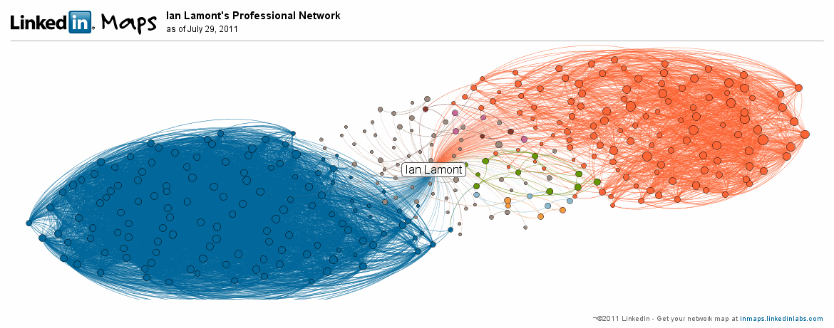
This is cool. LinkedIn has developed a visualization for members' professional LinkedIn networks. I spotted an example on a blog that I was browsing, and was curious to see what turned up for me. I was kind of surprised by the results:

linkedin data visualization

What's going on here? In a nutshell, my map reflects two major networks I am a part of: My MIT Sloan Fellows class (blue) and IDG Enterprise (orange).

The Sloan Fellows group of about 100 people are so connected with each other (i.e., nearly everyone is connected with everyone else in the group) that the lines between them form a nearly solid mass of blue. A few people on the outside of the blue mass are MIT students from other programs (e.g., the two-year Sloan MBA) who have a few connections with others in my class.

The orange network consists of former colleagues at IDG Enterprise -- mostly editors and technical staff but also some business executives. There are also many lines between them, but not nearly to the same degree as the Sloan Fellow network. That's because the IDGers are more likely to be connected to people in their own publications (Network World, Computerworld, The Industry Standard, etc.) and/or to people having similar roles (editors with editors, developers with developers, etc.). As I worked at three IDG publications and in many cross-functional teams from 1999 to 2010, I am pretty well connected across these groups.

Smaller LinkedIn groups: Who are they?

There are some interesting small groups near the center of my galaxy. They aren't necessarily close to me; rather, it appears smaller networks (light orange, green, and magenta) or single connections (gray lines) are shown nearer to the center of the visualization. The colored networks include a group of a half-dozen people (green) I met at the State of Play conference in 2007 and connected with on LinkedIn immediately afterwards. I haven't had much contact with any of them since then.

Another group (magenta) consists of high school pals who I have had regular contact with over the years, but are barely noticeable on the map, owing to the fact there are only four of them. Actually, there should be five magenta dots, but one of the guys who is connected with me is not connected with any of the others, and therefore shows up as a single grey dot -- even though he happens to be one of my closest friends.

LinkedIn Taiwan

Not reflected at all is my extensive network in Taiwan, which I developed over a six-year period in the 1990s when I lived in Taipei. If it were visualized, it would have about 20-30 people with slightly less density than my IDG network.

Why isn't it there? Two reasons that come to mind are the network predates LinkedIn by many years, and many of the people who I know from that period of life are Taiwanese and are therefore less likely to be LinkedIn users (social network usage in Taiwan evolved much differently than it did in the U.S. and other countries). While I have still connected with about a half-dozen people from my time in Taiwan, they show up as gray dots because I knew them from different settings (social, music, different jobs, etc.) and they are not connected with each other. It's also possible they haven't learned how to leverage LinkedIn, although there are many LinkedIn books available for people who want to understand how to create a profile and build their networks.

Nevertheless, it's an interesting visualization and makes me wonder if I need to develop other professional networks in new ways. You can try it out by visiting InMaps (Update: It's no longer active), which will require you to authenticate through your LinkedIn account.

Wednesday, June 08, 2011

Why new data visualizations fail to catch on


Eric Hill, a buddy of mine from my old Industry Standard days, sent me a link to a RWW article about a cool new iPad application from Bloom Studio that comes up with an interesting way of visualizing a digital music collection. The app is called Planetary, and here's what it looks like:


Planetary (voiceover) from Bloom Studio, Inc. on Vimeo.

I was impressed with what they've done, but I am afraid it won't go far in the marketplace. At one time I had so much hope for data visualizations changing the way we browse and understand information -- in fact, Eric and I spent a lot of time discussing how Industry Standard site content (news and prediction market data) could be presented in new and potentially useful ways. But in the past several years, after checking out dozens of new interfaces and data visualization schemes, I've come to the conclusion that most will never catch on.


It's not the fault of the designers, but rather the limitations of audiences. For many consumers, simple formats (e.g., longitudinal line graphs, like the inset image of the US$/Euro exchange rate over the past three months) and plain ol' headlines are all they need. I think part of the problem is grokking a new visualization requires new mental models. In my opinion, most people simply aren't willing to expend the effort, especially considering the huge amounts of information out there and limited time that people have to consume it. I've seen so many interesting, creative visualizations out there but most never make it in the marketplace. Planetary is cool, but is a solar system/galactic metaphor for browsing music inherently better than an alphabetically ordered list of artists/albums/songs?

See also:

Friday, June 18, 2010

The missing constituency in climate change negotiations

On Tuesday, about 50 of us from the Sloan Fellows "A" section participated in a fascinating -- and depressing -- climate change simulation. The exercise was based on international negotiations to reverse several global warming trends, as well as a tool called C-ROADS (“Climate Rapid Overview and Decision-support Simulator”). After arriving in a large conference room, we split into groups representing various nations (I was in the India group) and attempted to negotiate a climate treaty that balanced our national interests with the global imperative to reverse the amount of carbon entering the atmosphere. The C-ROADS tool, which was developed by MIT and several partner organizations, has actually been used by governments and NGOs to model policy actions and their impact on long-term greenhouse gas emissions and sea level changes (I've embedded a video below that explains how it works.)

If you paid attention to the horse trading and bickering that took place at Copenhagen last year, you are probably aware that it was impossible to get everyone on board. In the India group, we had several obstacles which prevented us from willingly signing on to aggressive reduction targets. Our briefing document instructed us to preserve economic growth at all costs, and we also had to be cognizant of the fact that India's population will actually surpass China's at some point mid-century, according to the projections we were given. We unsuccessfully attempted to tie the negotiations into demands for technology transfer and an end to European agricultural barriers. In the end, with a little arm-twisting and urging from the facilitator (Sloan professor John Sterman), we gave up these demands and signed on to more aggressive targets. In the C-ROADS simulation, this resulted in a reversal of several trends and a much smaller degree of global warming. The earth was saved!

Not so fast, Sterman said. He gave us an uncomfortable reality check about international climate negotiations: There is little chance all of these agreements would be ratified by the legislatures of the democratic countries that took part in the negotiations. This is because an important stakeholder has not been brought on board: The public. Many people are either not convinced of the need for drastic action, fear the negative economic impacts, or may resent the fact that some countries are receiving unequal treatment, even though they have contributed more to global warming in the past.

After the four-hour session ended, everyone in the room was amazed at what we had just participated in, but depressed about the implications. Is there nothing that can be done? A lot of fellows thought hard about this as we left the building. I actually had a few ideas that targeted the public awareness issue, and sent the following email to Sterman:
Your presentation yesterday afternoon was quite powerful and left a big impression on me and many of the other fellows.

I just wanted to add a few observations about getting through to the public, which you touched upon toward the end of your presentation. I come from an online news background and have some observations with how traditional mass media as well as new media tools can be used to reach the public.

The first is that, perversely, the visuals from the Deep Horizon disaster and the aftermath have probably done more to turn people to sustainability-related causes than any other event in the past ten years. The live video from the well location has been particularly disturbing for the many millions of people who have seen it. It illustrates everything that is wrong with offshore drilling and drives many people to ask the question: What are the alternatives?

The second observation is that visuals like these are often far more effective than data or prose in terms of bringing home the message about something like environmental change. As one of the other fellows told me as we left the Marriott, “instead of showing a simulation involving bar charts or maps, why not show images of people drowning?” It may seem like a strange idea, but creating a simulation of real areas being inundated or ruined by a breach would be very effective, even if no actual deaths were depicted. There are some graphics technologies related to video game design which could actually help do this — imagine a sim of New York City partially under water, or a massive breach overtaking water control features in Holland, Venice, Sacto, etc. This is the type of thing that has a large potential to either A) be picked up by major broadcast news outlets (especially in locales that are depicted) or B) “go viral” on YouTube and Facebook.

The third observation is that C-ROADS is an excellent tool for getting a global view of the problem, but there needs to be a simulation tool or tools for people to see how they will be personally affected by global warming. For instance, how about a simulation that lets people type in their address, and spits out an estimation of whether or not their home is under water, the estimated decline in value or increase in insurance costs, the impact on their community (refugee resettlement, difference in snow/rain/drought days) and even what sort of plants they can expect to see disappear from their garden, as well as new plants that will take their place?
Sterman's response was interesting. While visuals have been helpful in informing the public (he mentioned scientist-turned filmmaker Randy Olsen) he also sent a paper that he authored for Science magazine that noted the following contradiction in public attitudes toward global warming:

"Majorities in the United States and other nations have heard of climate change and say they support action to address it, yet climate change ranks far behind the economy, war, and terrorism among people’s greatest concerns, and large majorities oppose policies that would cut greenhouse gas (GHG) emissions by raising fossil fuel prices."

According to Sterman, another important constituency that needs to be handled with care are scientists themselves. He didn't get too far into this issue, but it's not hard to see why this is so: Different stakeholders respond to different messages and data points, and dramatizations intended for the general public will not work with people who are used to dealing with complex data and peer-reviewed research.

Video: John Sterman on C-ROADS Science and Confidence Building

John Sterman on C-ROADS Science and Confidence Building from Climate Interactive on Vimeo. MIT's John Sterman of the Climate Interactive team explains C-ROADS science and confidence building at the US State Department side event in Copenhagen. Image: Data points from C-ROADS

Thursday, February 04, 2010

How fast is the social Web growing?

Wicked. Darn. Fast.

Play around with the tool below. Click on the one-day option, to see how much has been spent on virtual goods, or how many YouTube videos have been watched. The numbers are astounding. Check out the other tabs, too, for mobile and gaming. 16 billion SMS messages sent worldwide since yesterday? Now we know why Verizon and other carriers charge so much for data and texting!


Link: John Bothwick

Friday, December 04, 2009

The Tiger Woods accident simulated in 3D shows the future of newscasts

Spotted on Fake Steve Jobs: A video from a Taiwanese news program that depicts Tiger Woods' car crash using 3D animation (starts at 15 seconds in):
Some people may find the use of an anguished avatar (Woods' wife) in a machinima clip to be funny. Indeed, I suspect that this unusual format for reporting the news is the reason it was included in a well-known parody blog. But for years we've seen similar techniques used to simulate airplane crashes or the microscopic interactions between drugs and the human body -- why shouldn't computer-generated environments be used to depict a car crash or other commonplace events?

3D news applications are often experimental (see my 2006 post on NewsAtSeven) and when you do see simulations of events on U.S. news stations, they tend to be limited to the national networks that have the required staff and computing resources. But once machinima tools get easier/cheaper to use, and/or incorporate public mapping data and even models of building interiors, I expect that the use of news simulations will rise dramatically. They will will get more sophisticated, too, thanks to the geodata as well as near-photorealistic computer graphics.

There is also the possibility of bringing 3D anchors into the scene, and incorporating other types of metadata, as I described in a 2007 paper:
In the future, similar news applications could allow 3D avatars to be customized to mimic real news anchors (Walter Cronkite, Katie Couric, Jack Williams), other real people (someone's father, a favorite teacher, a politician), characters based on a set of self-selected attributes, or one's own avatar. The avatars might be seated in a simulated newsroom, or could be moved to a computer-generated environment that mirrors the real-life location where the news that he or she is describing took place. The environment might be based upon geotags and other metadata that were generated by the original reports and video footage. The news itself can also be fine-tuned, based on specific categories, locations, times, and keywords chosen by the viewer. I may choose to have the first half of my newscast consist of developments relating to the New York Stock Exchange in the previous 24 hours. For the second half, I may restrict my anchor to reading reports that mention "China" or "Beijing" in the lede and have accompanying video footage sourced from any clip taken in Beijing or Shanghai within the past six hours. Detailed metadata would be crucial to creating such a report.
So, don't assume that the 20th century model used by newscasts today to report recent events -- handsome people in suits  reading from teleprompters and rolling clips of prerecorded video -- will hold true in the years to come. We'll be seeing more 3D simulations, animations, and avatars, as well as an increased use of Internet-based data sources to get an understanding of the news.

Sunday, October 25, 2009

Google Visualization API

After seeing this video, reading the API documentation, and playing around with some of the scripts, I'm realizing that this great toolset is making an impact on a lot of startup Web services. Google Finance uses it, and I saw another Twitter-based service that incorporated some of the charts as well in just the past week. The best things about the Google Visualization API: It's free, it's based on javascript, it's relatively easy to use, and it dovetails into people's existing Excel/spreadsheet projects. Geek out ...

Tuesday, November 04, 2008

Wordle text visualization: Cool, but not killer


A Wordle tag cloud, based on this blog as of Nov. 4, 2008. Common verbs, articles, and other words are stripped out, and the most frequently mentioned word gets the largest font. I wrote about Apple mice earlier this week, and the word "Mouse" is mentioned on the home page eight times.

You can randomize the appearance to try different fonts and colors, which is fun ... for about two minutes. Like many data visualizations, it's really cool but hardly a killer app that you return to every day.

Images are licensed under a Creative Commons 3.0 license.

Tuesday, June 12, 2007

A music fan's data-driven dedications

Entertainment visualization from Earl BoykinsThis should appeal to anyone who works with quantitative research and is a music fan: It's a blog devoted to entertainment-related data visualizations.

Emo+Beer=Busted Career hard to describe unless you visit the site, but some of the examples include color-coding newspaper reviews of pop music according to whether the sentences within the review were informative, positive, negative, or jokes. Another applies colored bubbles of various sizes that describe the blogger's Lil Wayne tape collection.

The blogger in question is named Andrew Kuo ("earl boykins"), and he even got a write-up in the New York Times, which also supplied a summary of visualizations that apply to one of Kuo's favorite artists, Bright Eyes (Conor Oberst). See some of the charts which the Times gathered, such as "Quality Arc of Each Show," "Number of Times Certain Entertaining Phrases Were Shouted," and "Number of People Onstage at the End of the Encore"